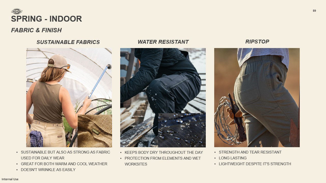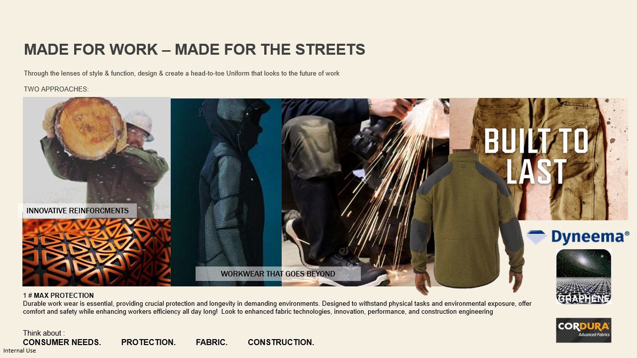
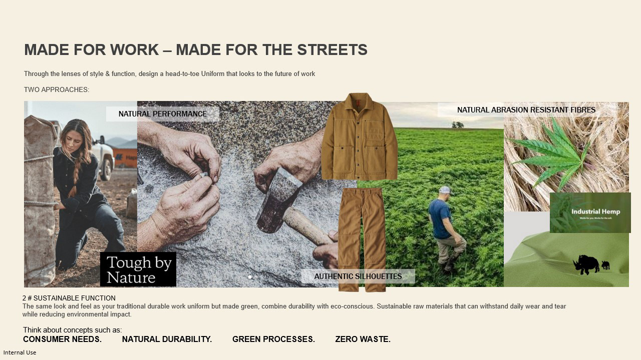
Another element that we considered is the lens of sustainable functions, how to get the same look and feel as traditional workwear but reducing environmental impact.


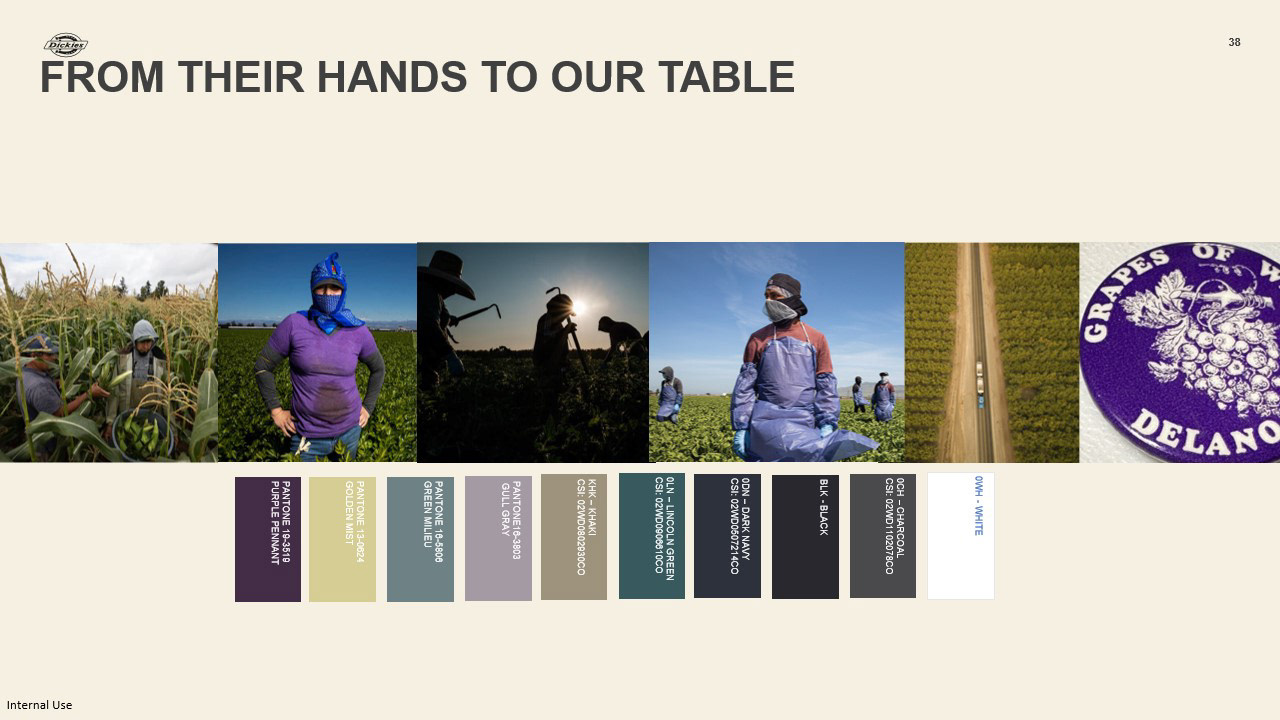
Introducing our outdoor core color palette, from their hands to our table, inspired by the farmworkers' day from their very early mornings to their late night and the colors the sky turns in from dusk to dawn. Inspired by the colors of the environments. Purple Pennant in the core color palette is a nod to farm workers' fight for safe environments.as well as weaving Dickies core workwear color as the unifier.
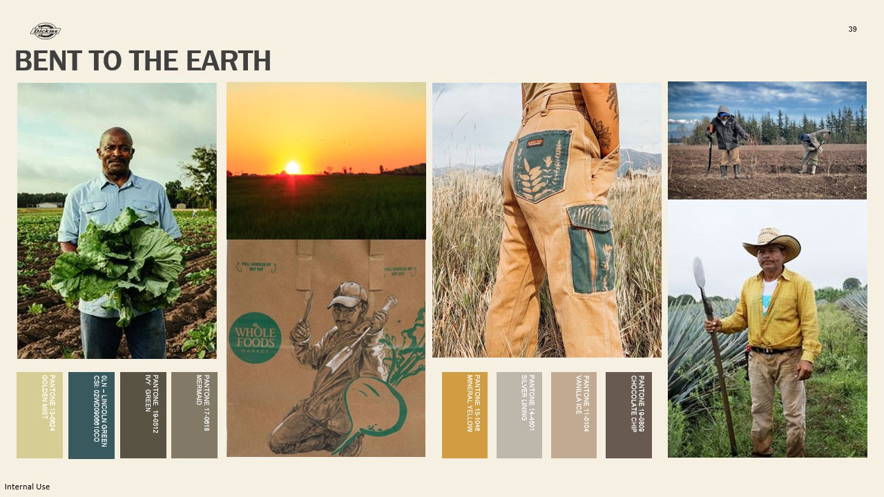
Bent the earth story expands on the earth tones and greens from our core palette. inspired by the land farm workers spend working the earth from harvesting to picking. Considering colors that are traditional for workwear but also incorporating colors that could take it to lifestyle.
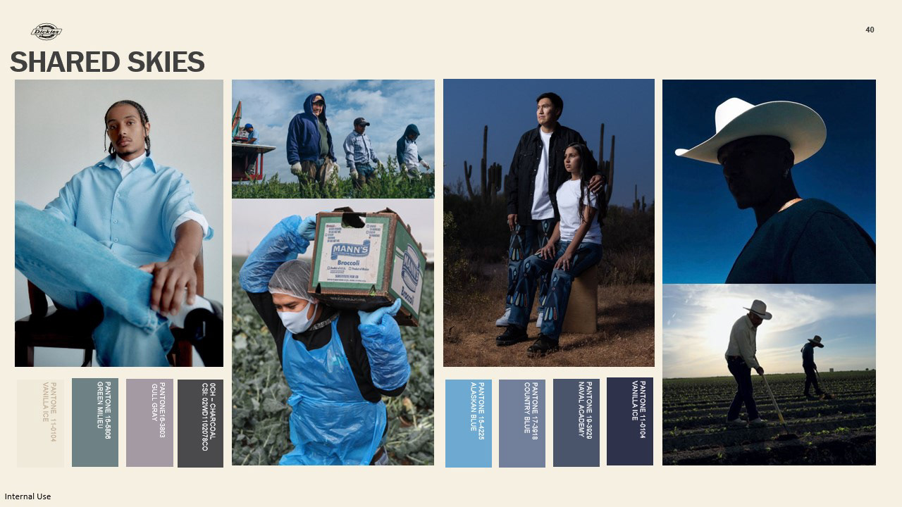
Shared skies focuses on expanding the cooler tones and blues from our core palette. inspired by the idea that farm workers across different regions are working under the same sky and the different weather elements they work through from blue sunny skies to rain and overcast skies. The same sky the consumers of their labor are under and the connection we have with farmworkers everywhere. Providing different shades to aid Dickies core colors and can translate from work to life.
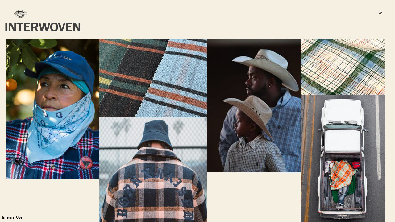
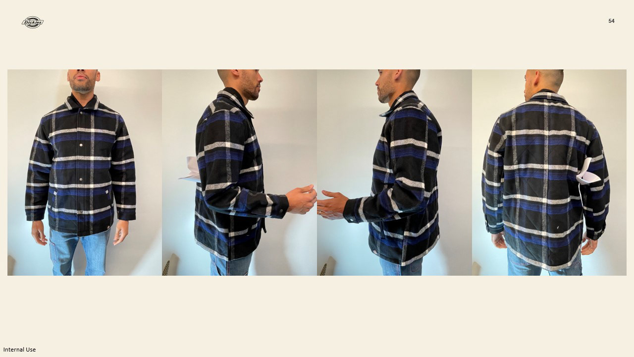
We wanted to incorporate a plaid for outdoor consumers. Many flannels tend to be something that farm workers always look for. We were inspired by the history of plaids in workwear specifically in farmworking, plaids being a design attribute that can also go from work to lifestyle.
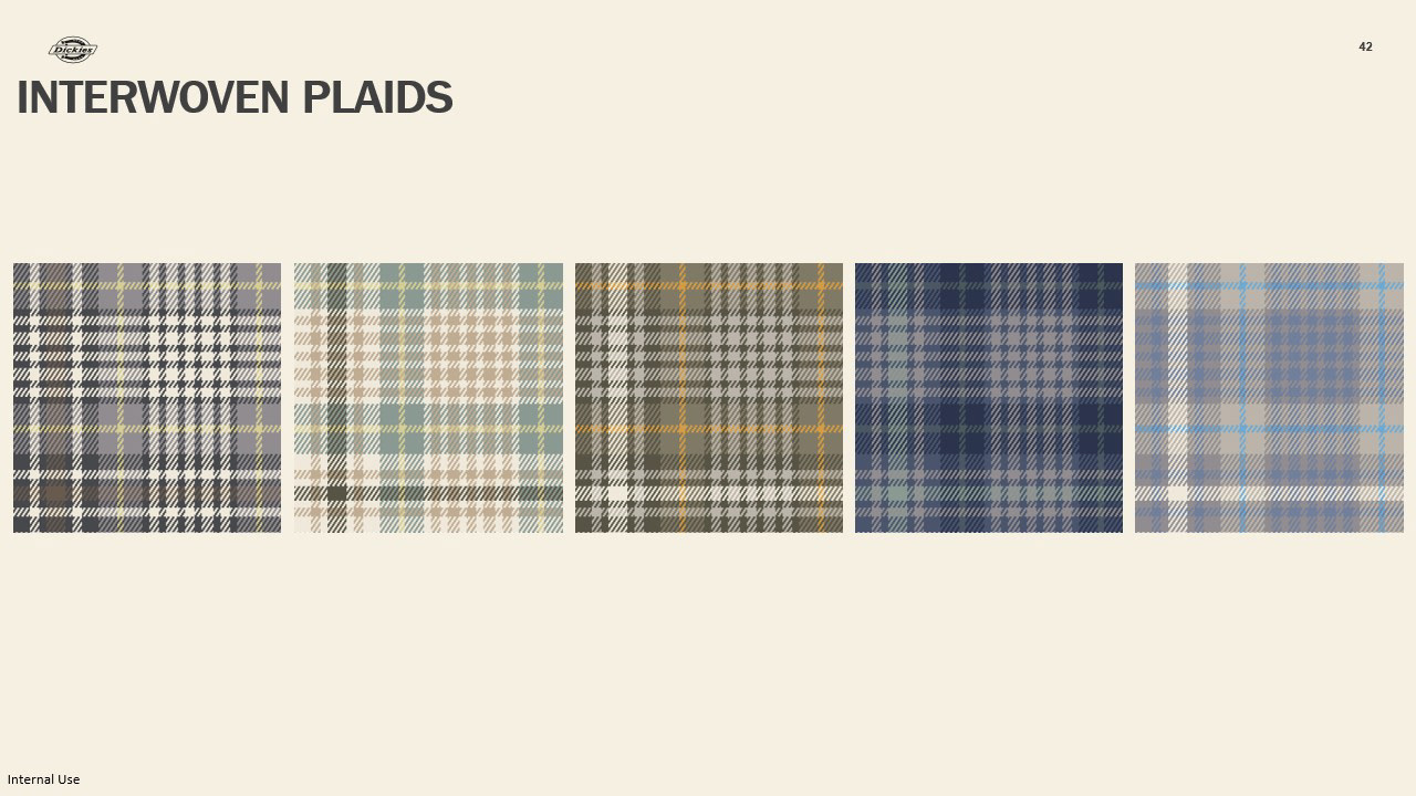
Through the interwoven plaid we were able to really incorporate both shared skies and bent to the earth palette to unify it. We made sure we had both overall darker plaids for the consumer who will gravitate towards darker tones because their work can be dirty and that is something we don't want them to be worried about, but also wanting to give the option of lighter options for a transition from work to life.
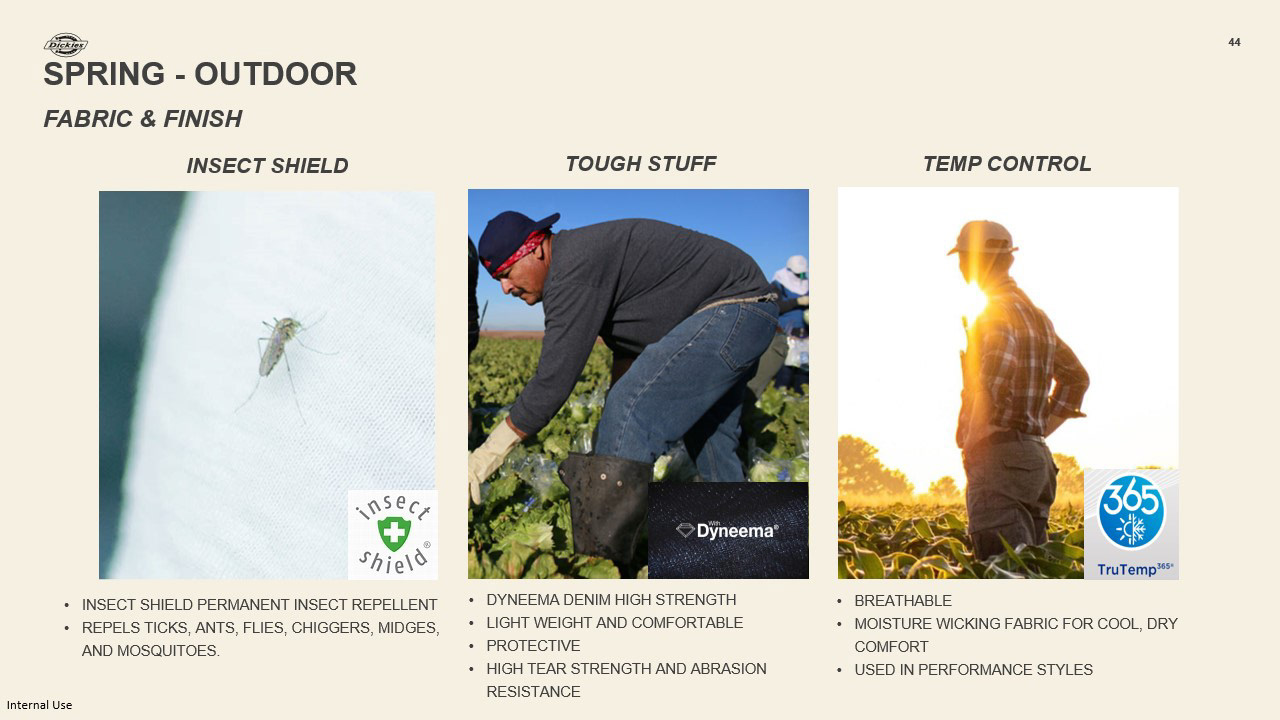
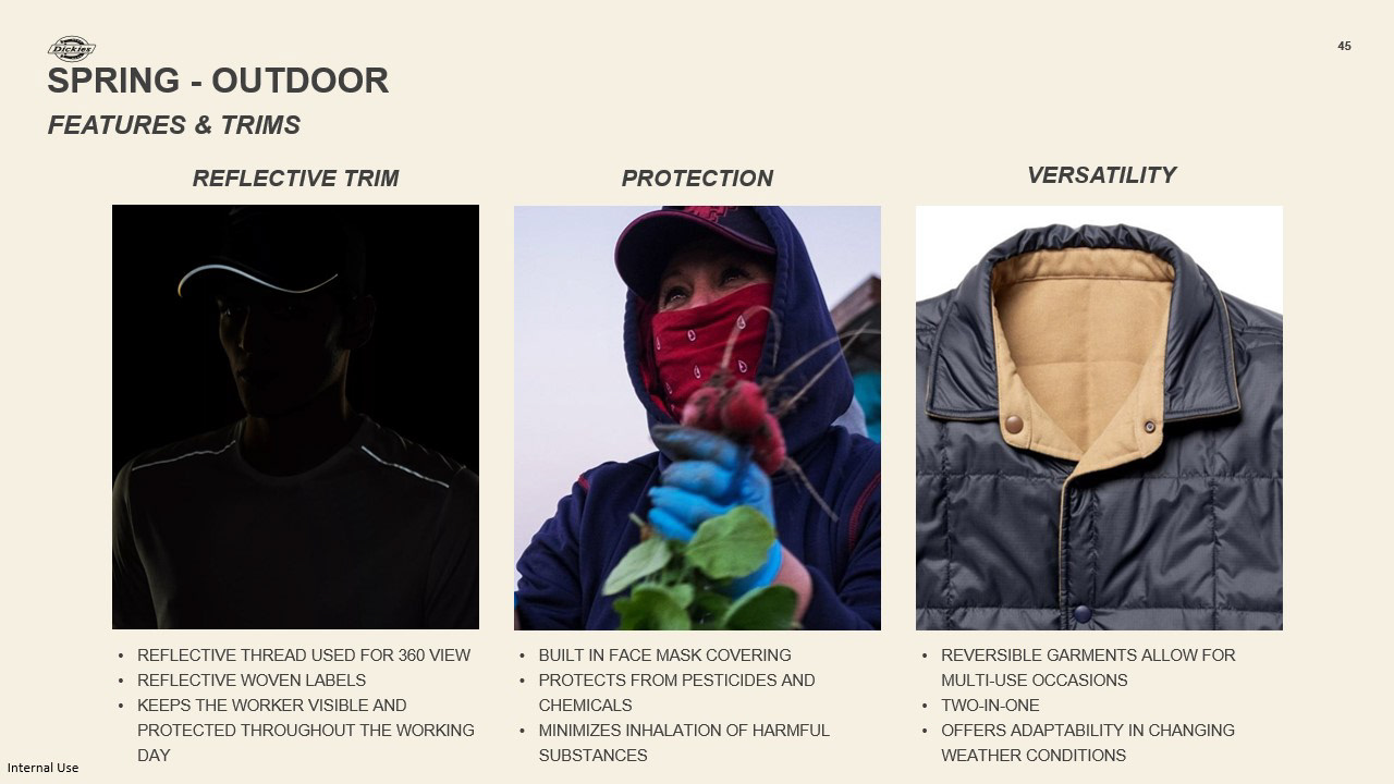
We also focused on 3 features and trim for the first We focused on visibility, by using both reflective label or logo and specifically threading to make sure the worker is fully visible no matter what. There are farm workers who work the overnight shift and this would be a protective element but also for workers who work day shift and are beginning their day around 4-5am when the sun is still down so they are protected.
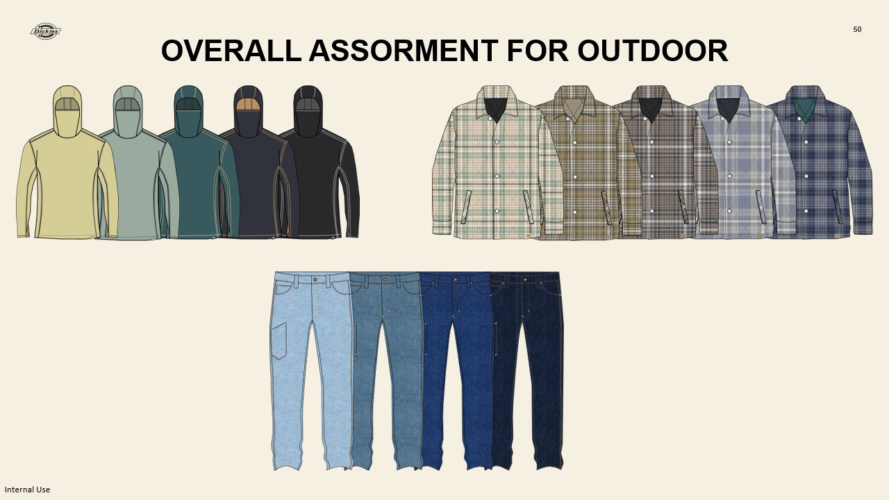
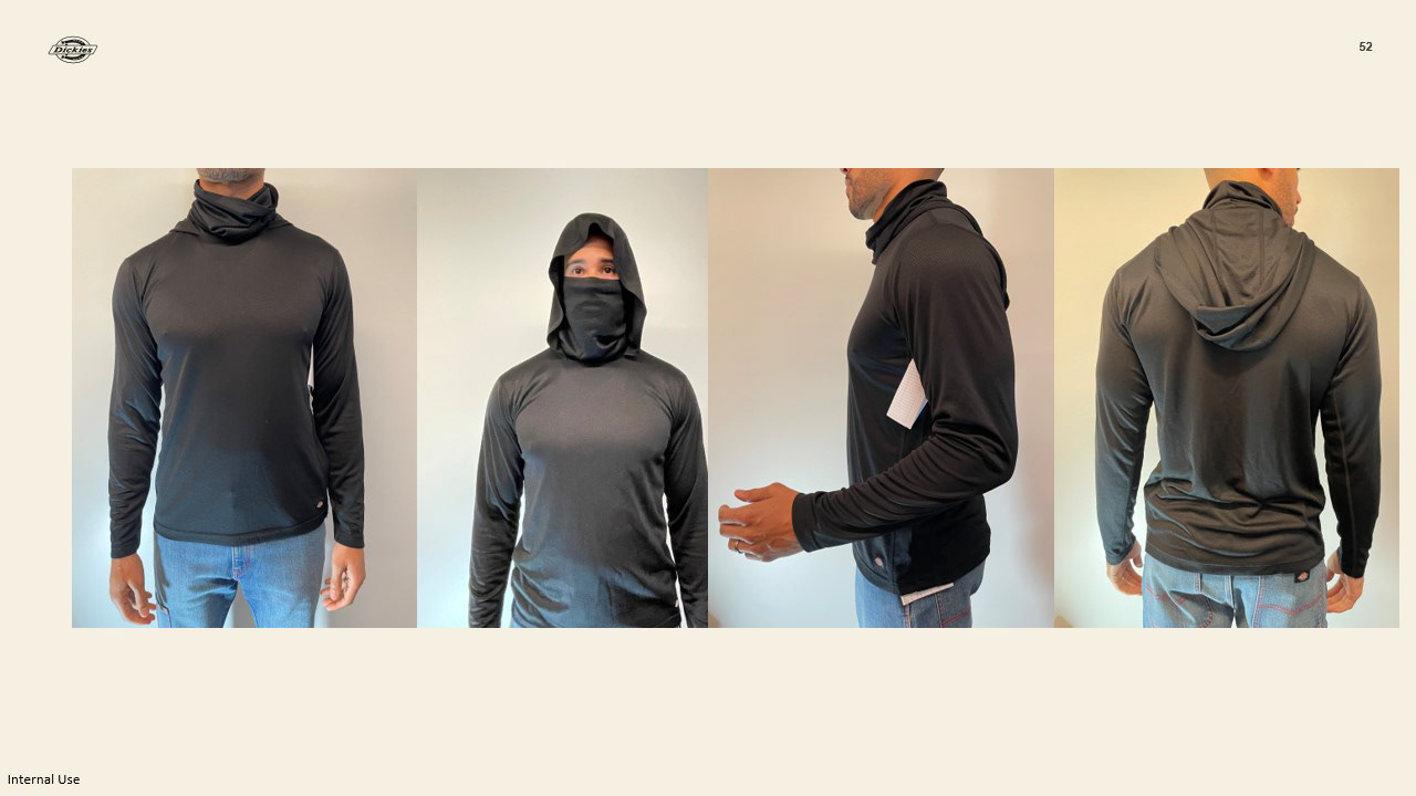
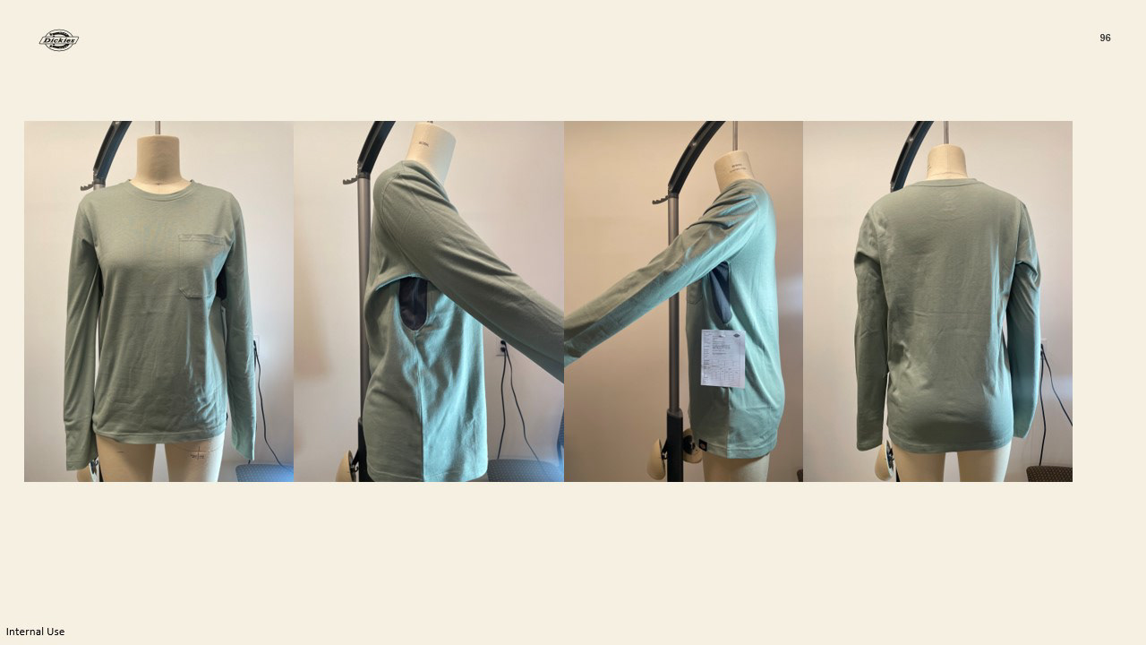
We were also able to get samples and have them fit on the model and we were able to see where some adjustments could be made.
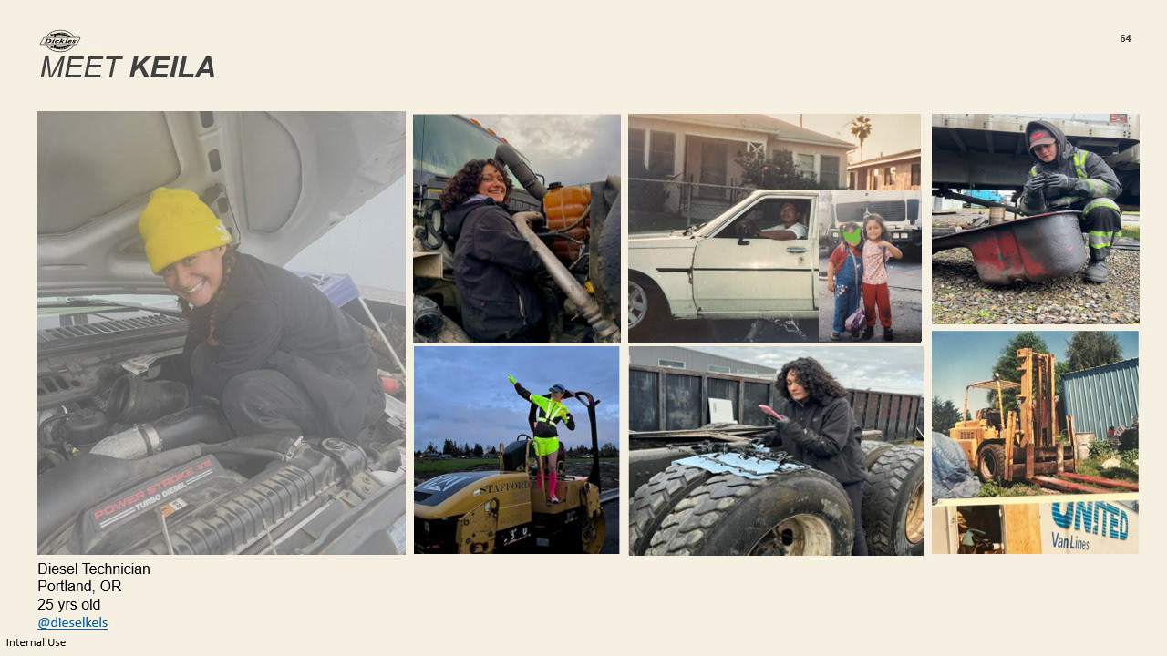
We want to introduce you to Keila. Meet Keila, Keila is a diesel technician from Portland, Oregon in her free time she travels, runs, and likes to try new food. She works with her dad in the family business where they are techs and mechanics focusing on fleets and larger vehicles specifically in dieselWhen looking for our indoor consumer to focus on we came across Keila through her content creation on Instagram and Tik Tok.
Through the power of social media, we were actually able to connect with Keila and ask her some questions and we picked 5 that really presented interesting findings about how she’s dressing and her workday. The first one being a way to better understand what her day looks like to best meet her needs.
Although we are focusing on indoor workday conditions, we also wanted to understand if there were natural elements that Keila considers when working or dressing.

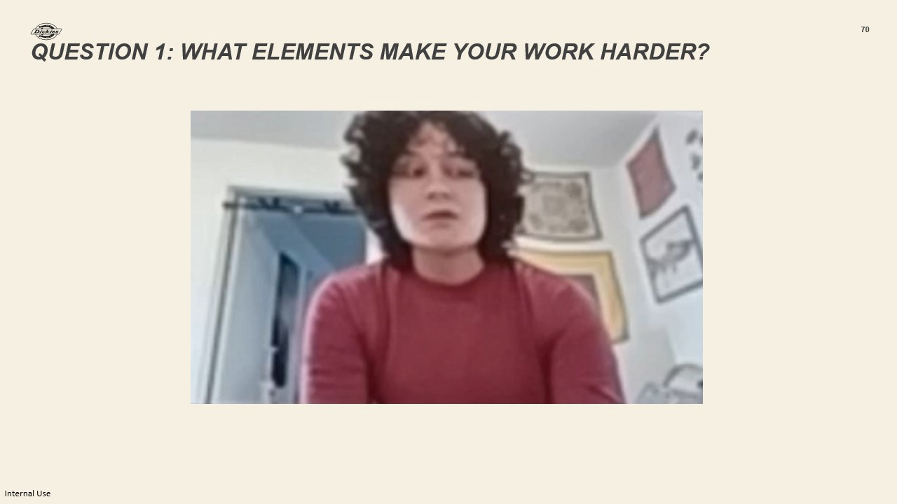
Through the 3rd question known as consumer, there can be materials and features in apparel that sometimes makes a job harder and we wanted to understand what those things were for people who work in the automotive industry especially as a women.
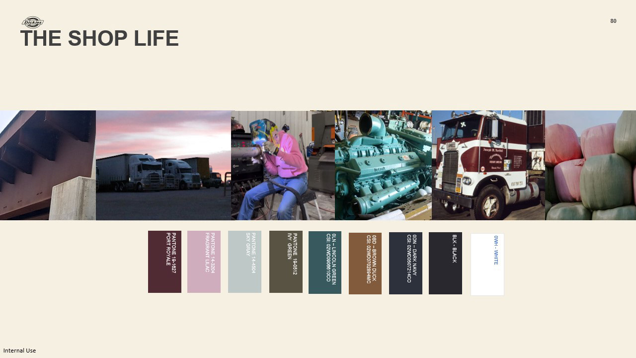
The shop life color palette is our indoor color palette it is inspired by the consumers day to day and surroundings such as working on fleet trucks, the engine work, but also very largely influenced by our conversation with Keila about the lack of pinks or softer colors in the women’s workwear in combination with Dickies classic core colors.
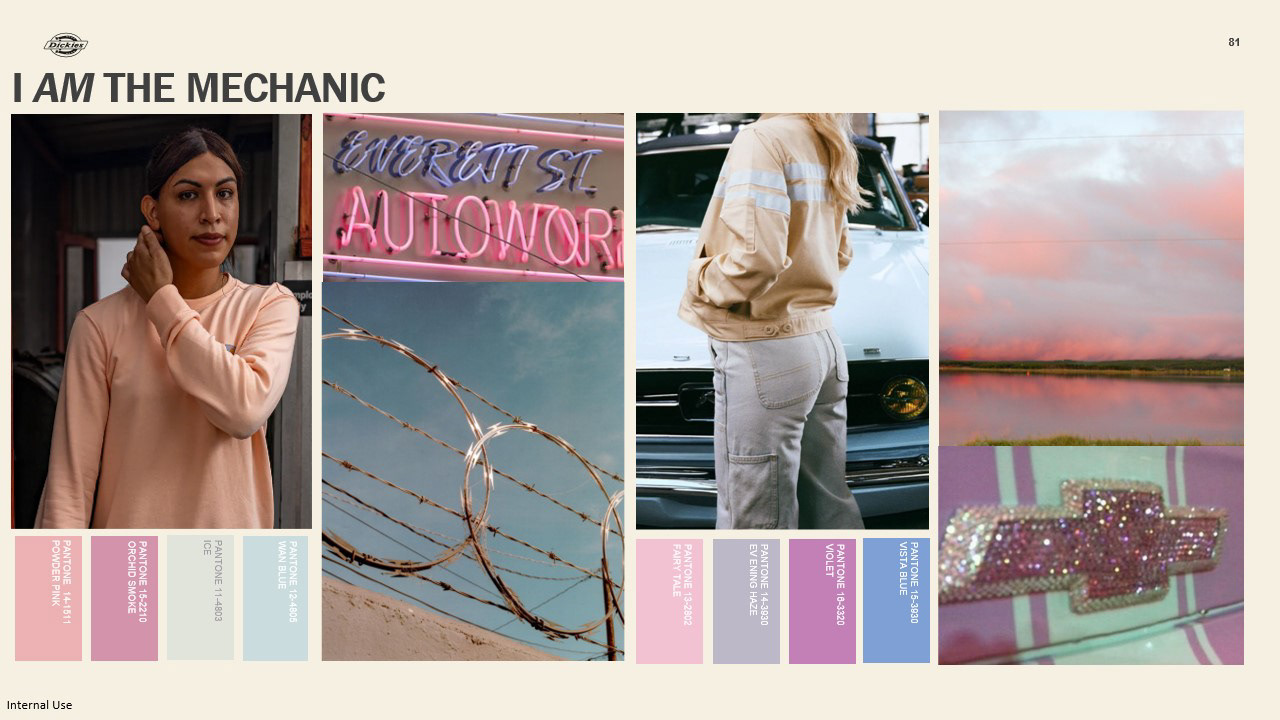
From the core palette the mechanic palette focuses on the pinks mauves, and softer colors from our core palette. This would live as trim, threading, labels, graphics hits it doesn’t mean it needs to live in big areas. A great place these colors could live are in accessories such as beanies, hats, gloves, etc.
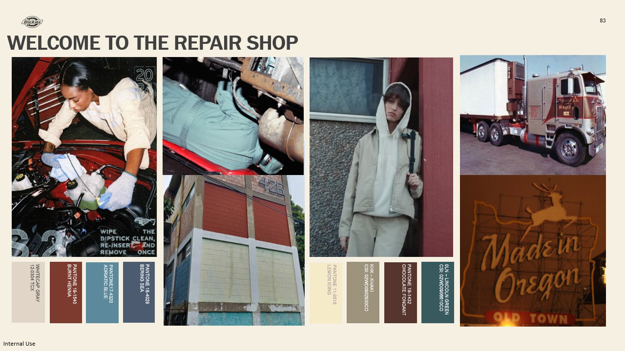
Welcome to the repair shop that focuses on Dickies core. Very inspired by Keila and her background and the work she and other automotive workers are doing. Really bringing in the colors that are core Dickies but adding slight variations and options for the consumer who feel more comfortable in the core palette and is able to add small accents of colors form I am the mechanic to create a comfortable mix between feeling comfortable and showing their personality.
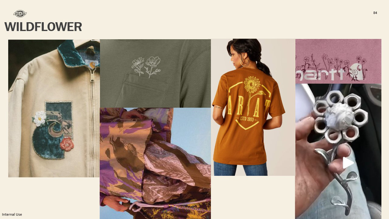
After talking with Keila and doing our research on what graphics in the market are currently an option in the women’s section, we noticed the need for small hits in women’s apparel. Once again beginning to cover that white wall not only for Dickies but for workwear in general where there are currently a handful of brands that are incorporating these elements into their apparel. Also considering how it can go from work to lifestyle.
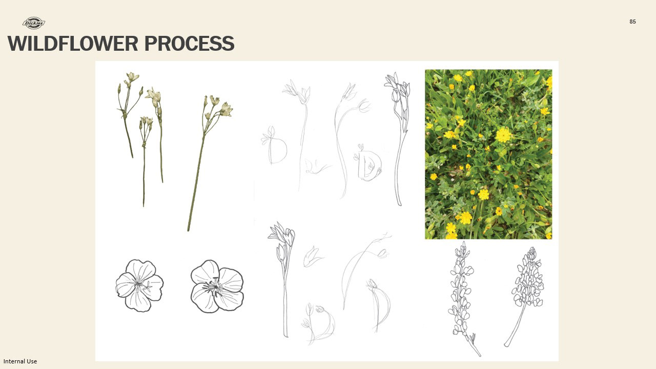
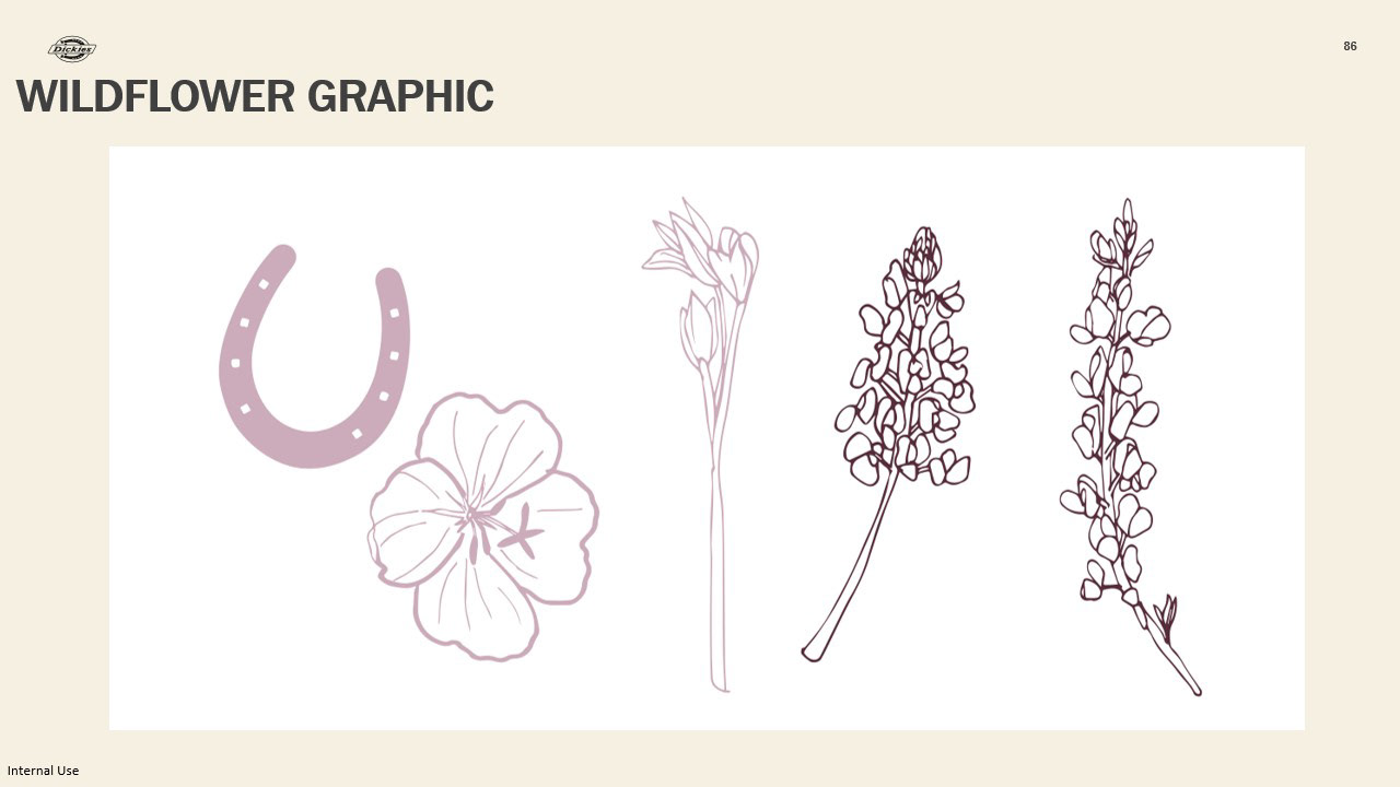
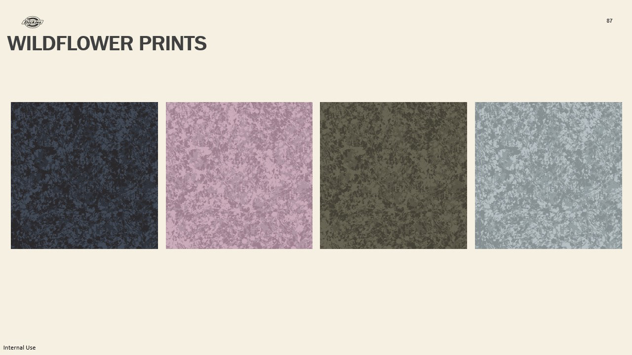
This is our process for our wildflower print and graphic, using fort worth local wildflowers that sprung during spring as inspiration. Florals are often what are considered introductory prints/graphics into brands, and would be a good way to bring this growing workforce and shop up.