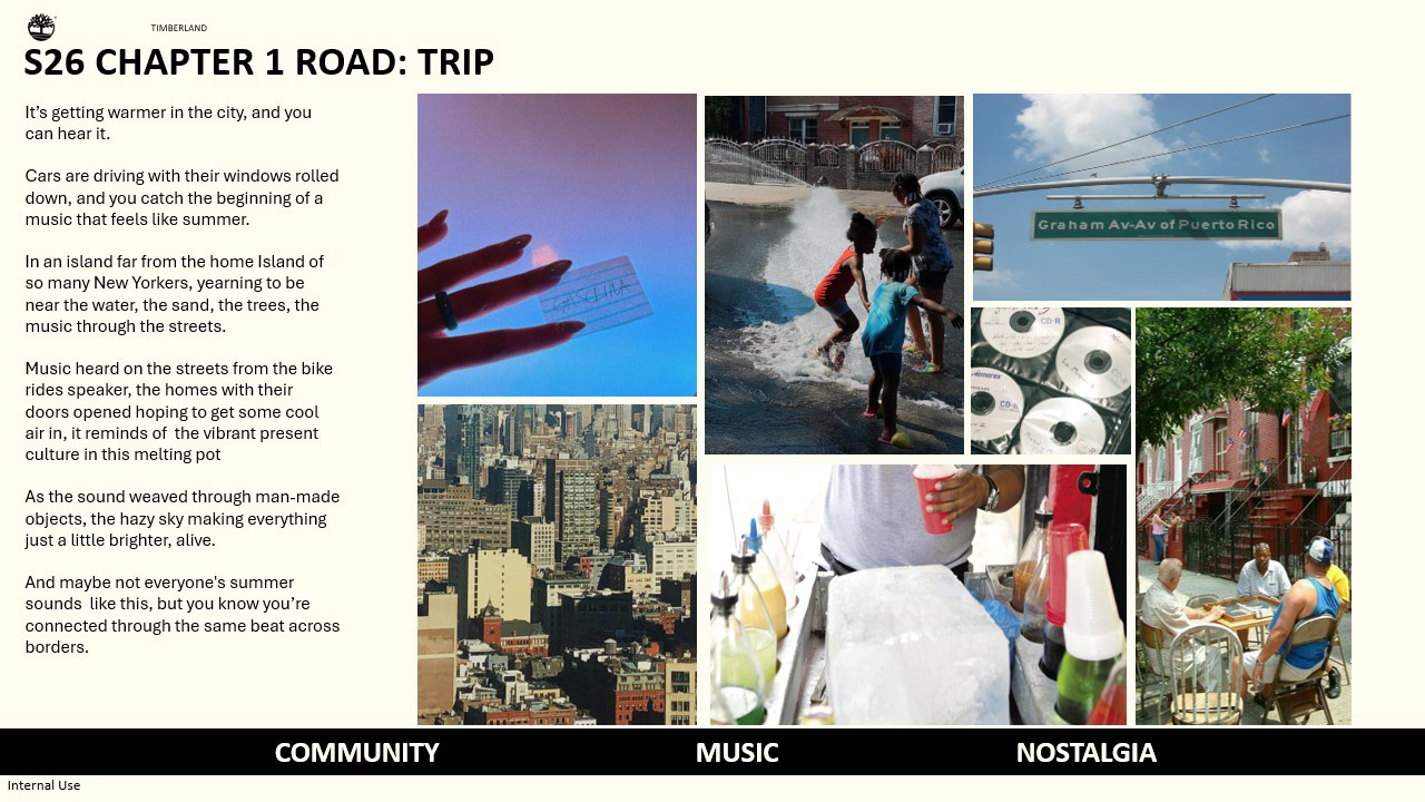
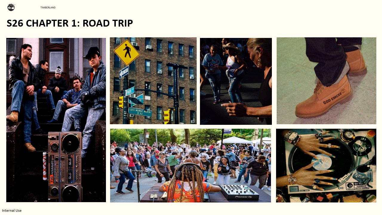
Timberland being a brand that has been adopted into different music spaces but the one of the most significant is the adoption of Hip Hop and street style in NYC and the long lasting impact we see today and the efforts to continue to celebrate that adoption. That being said, for this concept I wanted to introduce a genre and community that has been alongside Hip Hop and has greatly taken inspiration both from the style but also the music. And that is Reggaeton and Puerto Rican culture in NYC and how they have been interwoven with both NYC but also Hip Hop. If Hip Hop is one of Timberlands albums Reggaeton can be a feature in one of the tracks.
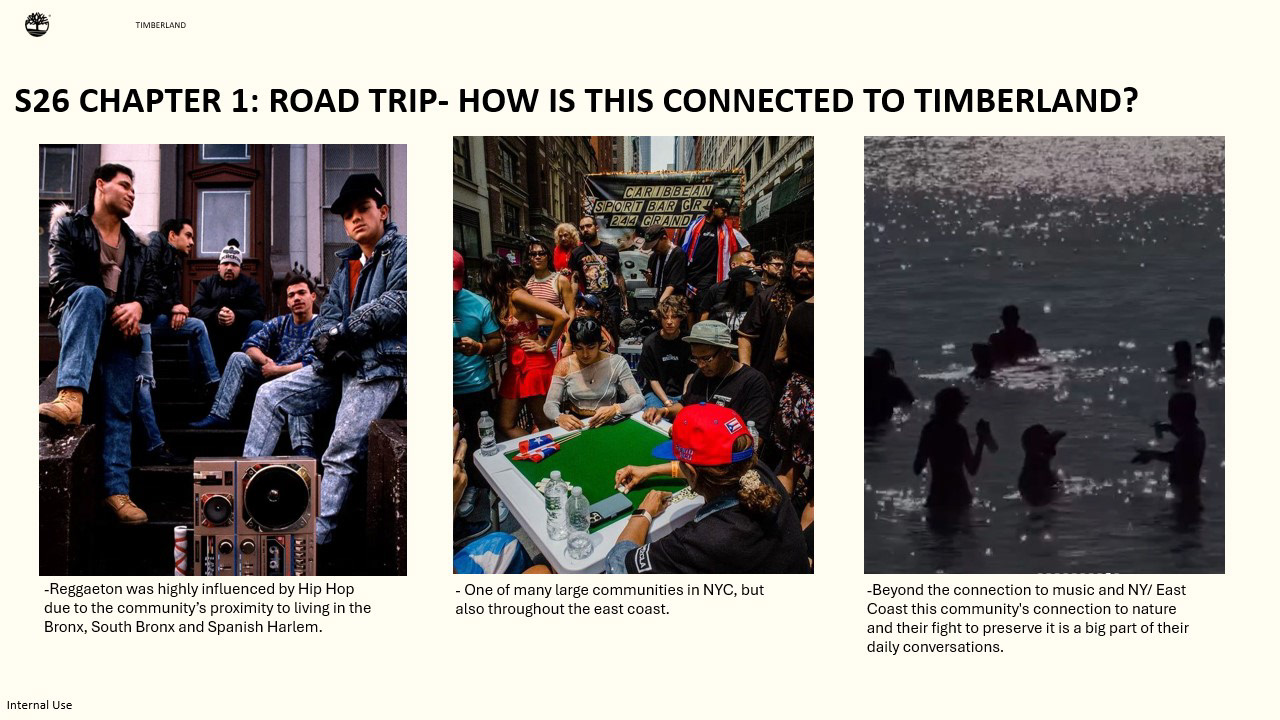
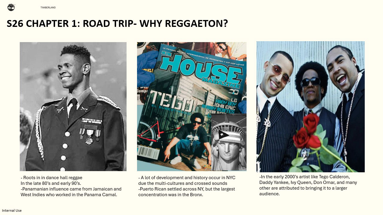
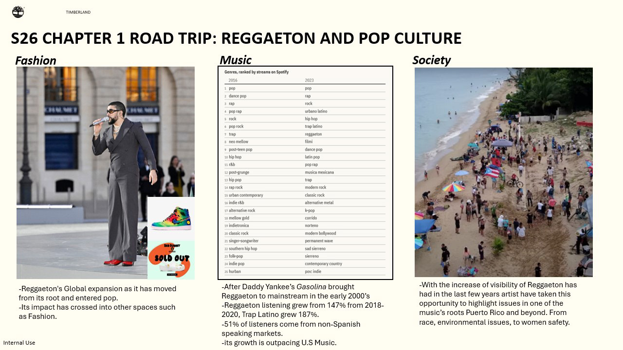
The mood board and color story is heavily inspired by the puerto rican culture in NYC and how Reggeaton intertwines through the connection it has to the city in proxy of Hip-Hop. Wanting to celebrate this community and culture alongside of the place many have called home for decades and conversation it has coexisting with other communities in the city and how they have impacted each other.
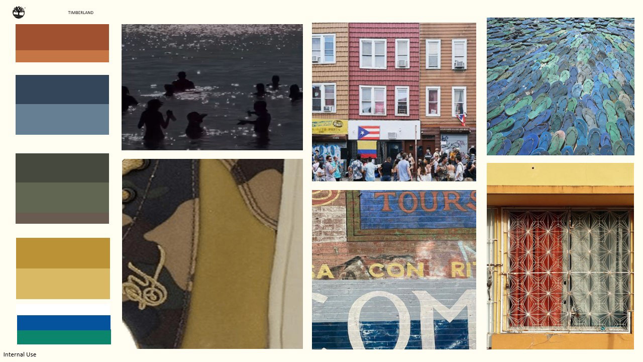
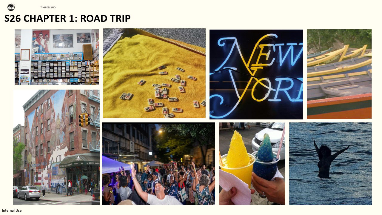
For spring the color assortment is very inspired by the colors around neighborhoods such as spanish harlem “el barrio”, and the history you can see in the buildings. But also inspired by elements captured in Puerto Rico and what being outdoors might look like and the colors that come from a different perspective.
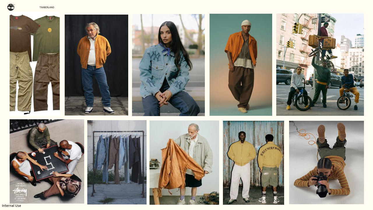
Showing how these colors could show up in apparel and how they could be outfitted from research. Sticking to more washed colors as we’re coming out of winter and how these colors integrate to winter colors since spring for many places can still look a little cooler especially as spring seasons seem to become more elongated with wetter springs.
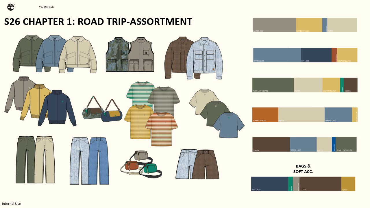
My hope with this assortment is for it to be genderless, especially when I think of street style where folks tend to stick less to gender labels and it’s more about how it’s worn. Spring is the larger drop so being really considerate how the color palette can show up on the floor and how it can work with each other using past styles. I picked past styles that could be assorted into more lifestyle/street style pieces. Inherently a lot of street style clothing are pieces that can be seen as preppy such as rugby shirts only the way they are styled and sizing is exaggerated but when you strip it down they are familiar pieces that are very simple. It’s the context where the clothing are placed that changes its definition
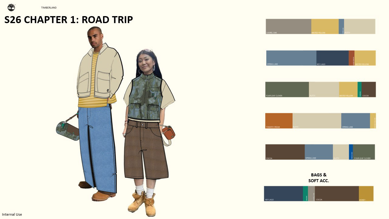
I wanted to outfit some of the pieces in the assortment to show how they could be styled to show how the colors would work in a head to toe look.
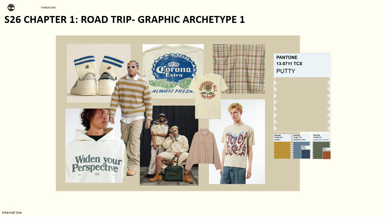
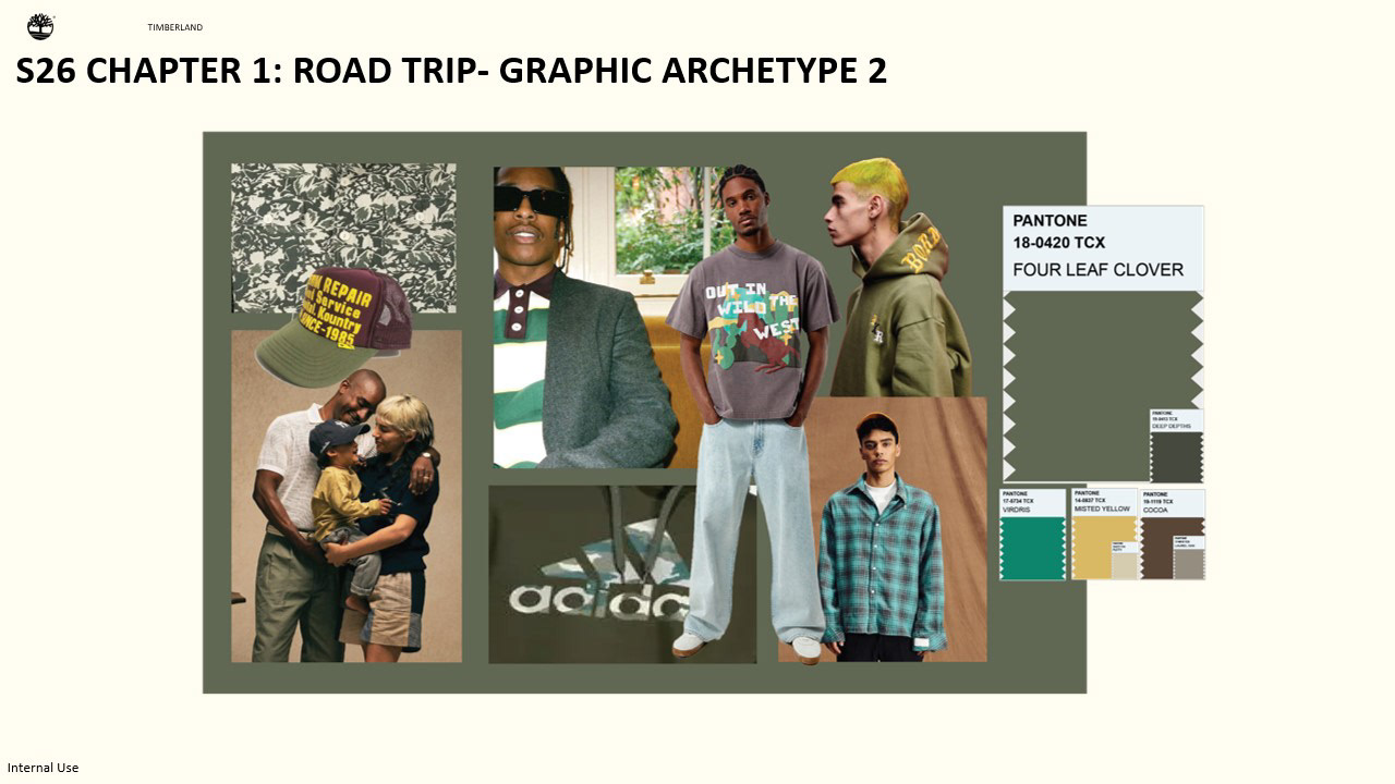
I also wanted to create a reference point on how these colors could show up in graphics for recoloring graphics.
Before moving on to Chapter 2 I wanted to present a few ways Timberland could potentially show up in this concept. I was really inspired by one of the share outs in which in an upcoming season Timberland would share how Timberland shows up globally, and I asked myself how it could show up from a different angle in a place that feels like a second home to it. Although we all experience Spring. It looks different, the music that is listened to the activities the spaces we seek connection with might look different and celebrate those differences and how they’re still part of the Yellow thread and feel genuine.
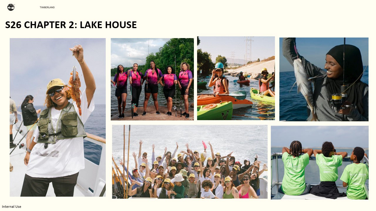
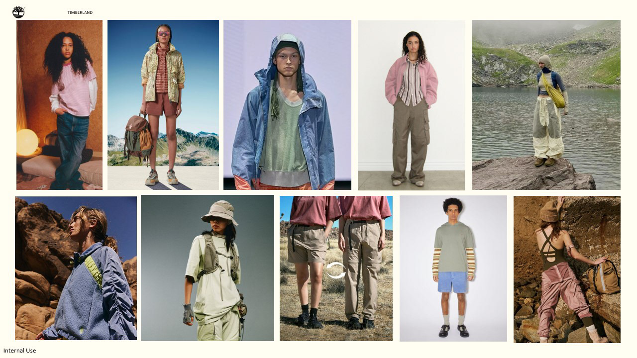
For Chapter 2 I wanted to focus this concept on fishing and opening up the conversation about diversity in the outdoors. Although this isn’t a new conversation when talking about the outdoors, we really wanting to focus on understanding the why, so we are able to show up in these species authentically and continue to champion folks who are opening these experiences to folks who are not the majority in these spaces.
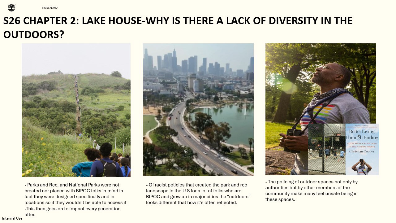
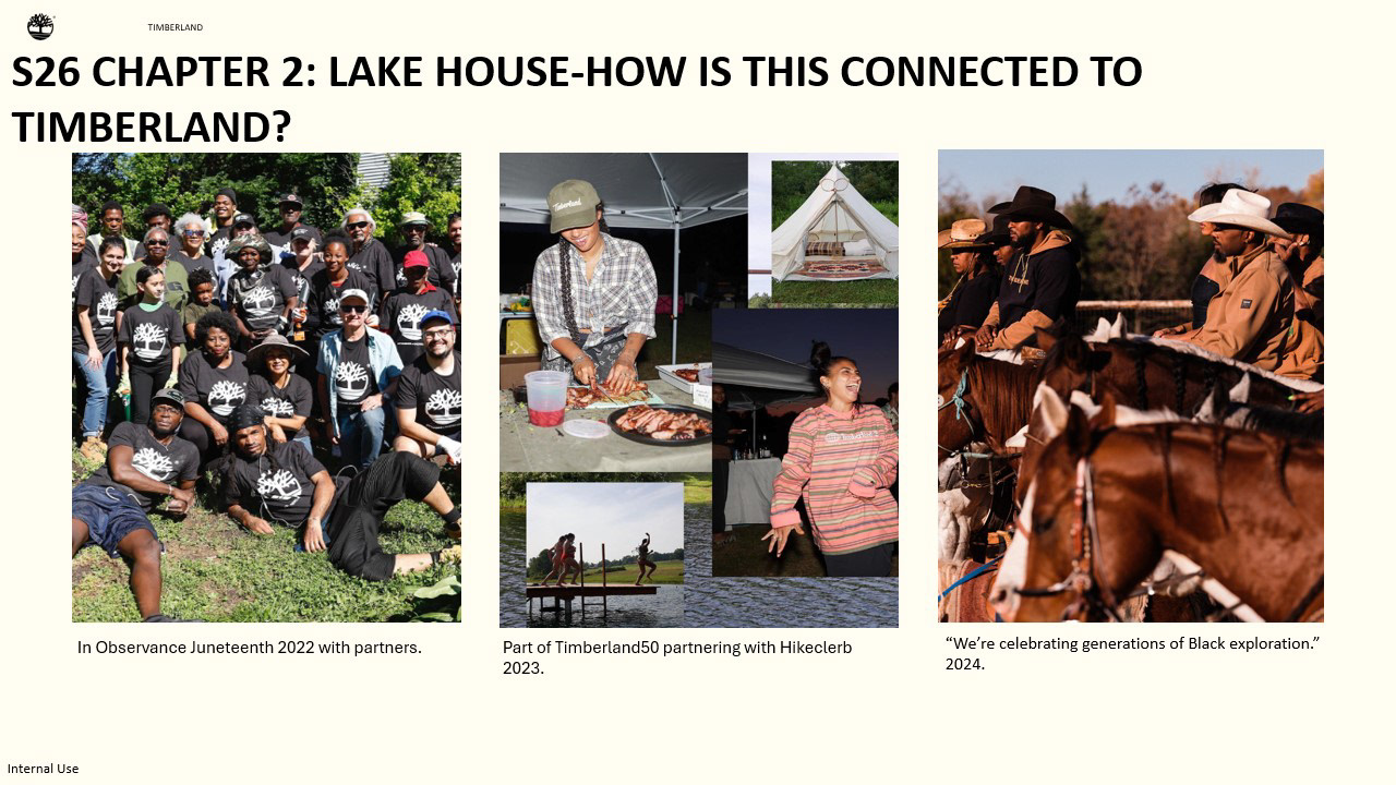
Timberland has been a part of this conversation and continues to have it by creating marketing campaigns and partnering with folks in the BIPOC community but specifically black community and championing folks in these spaces who are actively trying to change the current stats. It is important to not only show diversity but to understand why we are showing up, why these conversations are important beyond them just being right or in par to conversations that are happening at the moment. Especially bc consumers can sense when something is genuine or not, and having deeper understandings can lead to deeper connections to these movements.
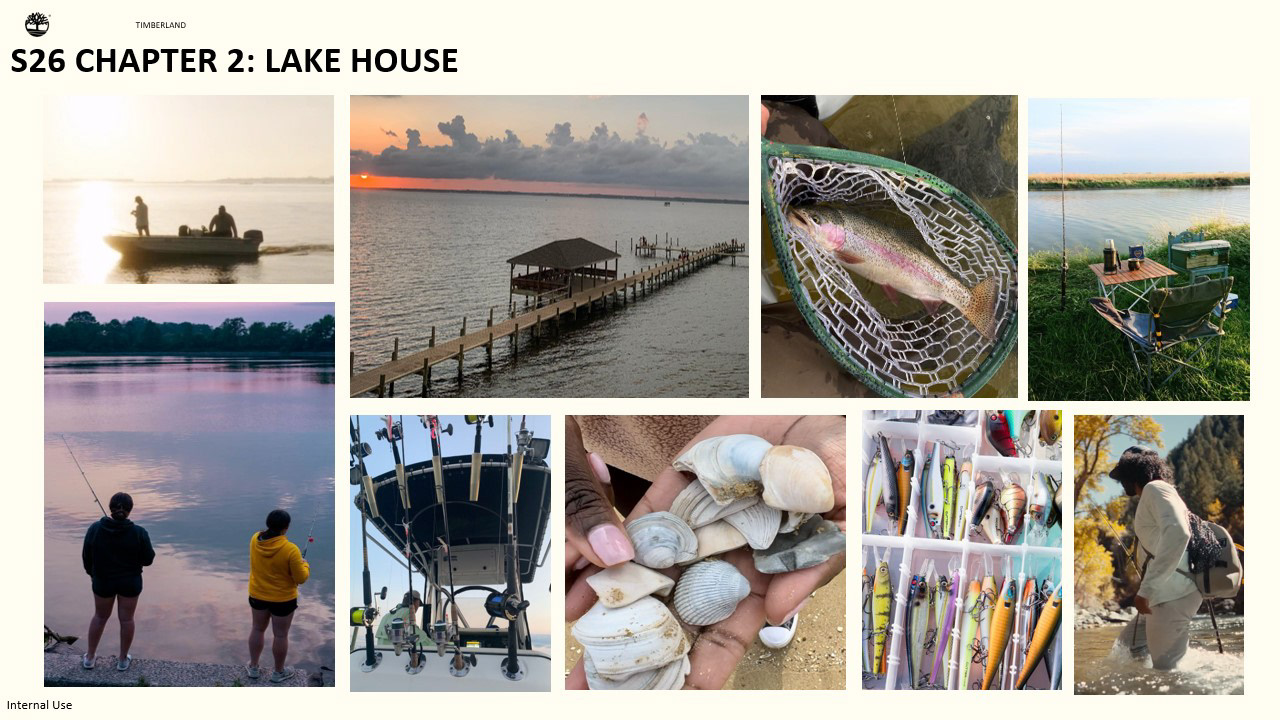
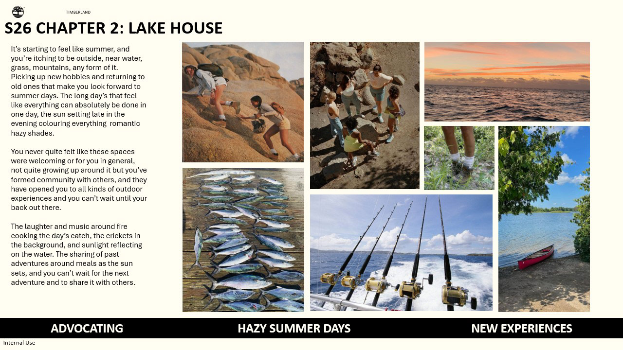
I wanted to focus on fishing for chapter 2 because it’s a sport and hobby that is often not as diverse, but aso bc of how tranquil and joyous the activity can be and to show this is an outdoor hobby that also has folks who are BIPOC that participate in it. For many ppl the lake house isn’t something that is as familiar but being near water, whether that is man made pond fishing in a big city, the sea, or nearby lake and rivers, there isn’t a “right way” to being outdoors. And the diverse ways you can be outdoors creates a bigger reflection of diverse people in it.
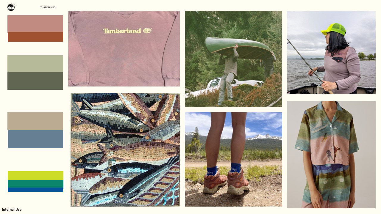
Summer is a smaller assortment I wanted the colors to also reflect that with smaller collection of colors and staying in the more muted tones with some fun pops to really reflect this relaxed hazy feeling of summer
I also wanted to show how this color assortment could show up in outfits and how they could work next to each other.
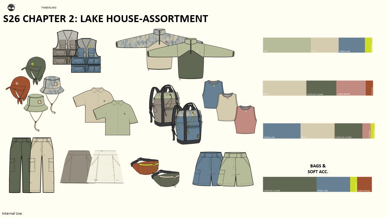
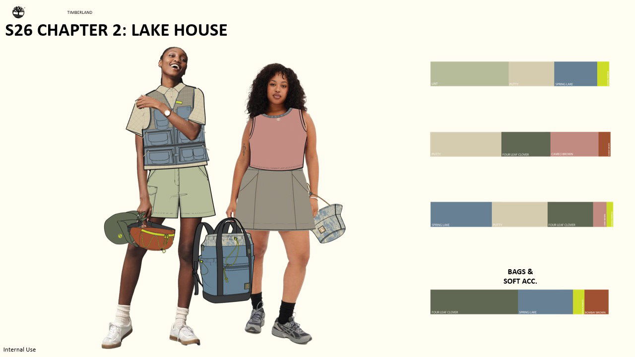
And here is the entire assortment, Colors such as spring lake and four leaf clover and bombay brown all being colors that live from Spring on to Summer. Bc Summer drops are smaller when thinking about the color palette as a whole being considerate that these colors would be able to live for both drops seamlessly and next to some of the new introductions. And thinking about how these work head to toe, by themselves, and layered. Wanting the outfit in terms of color to still work when you un-layer.
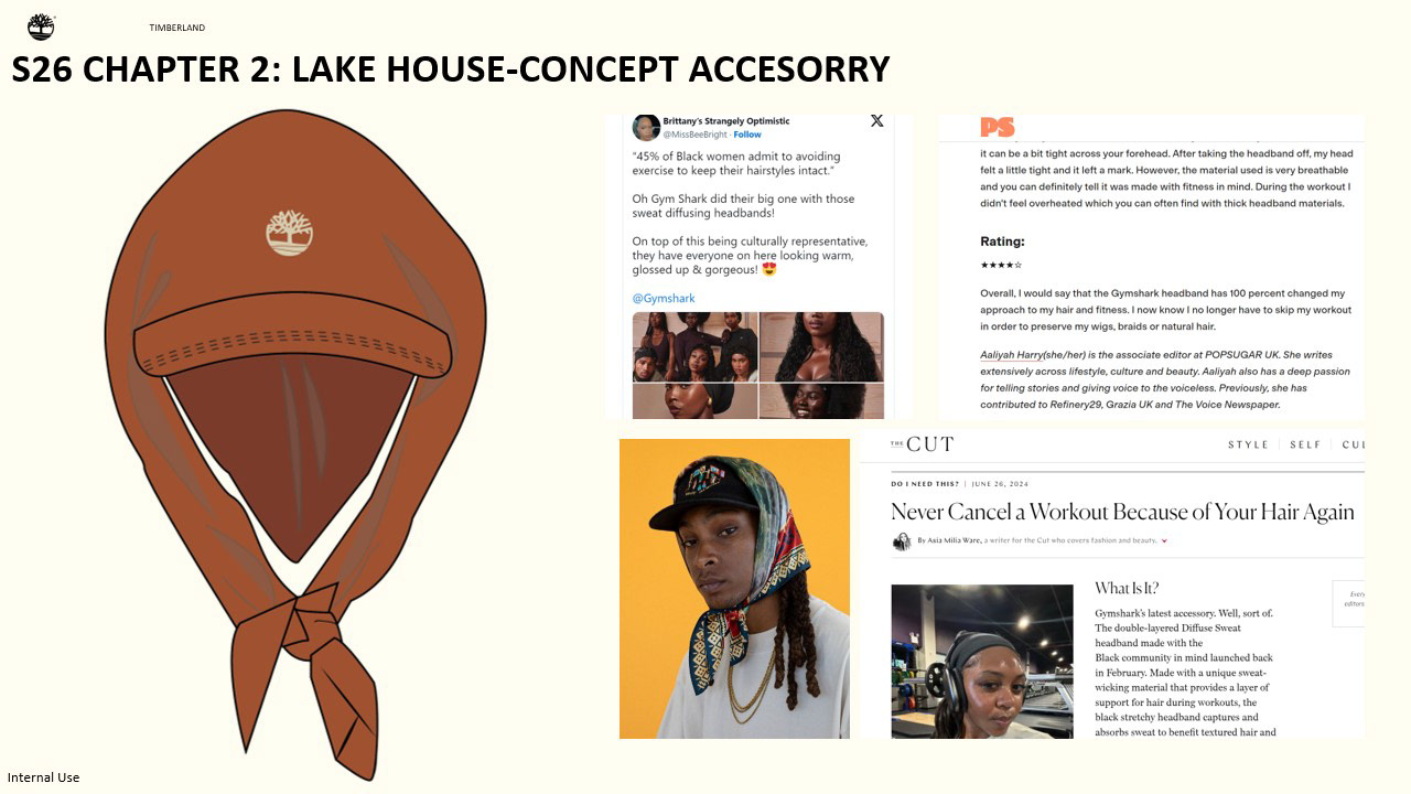
As a part of the assortment I also created a concept head piece that would be specific for this concept. I was inspired by the GymShark launch of their head band that quotes “We built the Diffuse Sweat Headband with the black community and all hair types in mind, so you can get the most out of your workout.” with sweat wicking properties. Gym shark held a discussion group with UK Black influencers to talk about the limitations of training with textured hairAnd then partnered with Whitney Adebayo to create it. Although this effort was created for gym goers and gym sharks “goal is to ensure our community feels comfortable stepping into the gym, and we strive to address any battles they might face before even reaching the door.” By addressing a concern folks might have about being active and actually creating an item that would make it easier for them and with them in mind. This is a concept and would be interesting to do further consumer research around it to get design just right as well as partnering with people who are experts in this. To not only dress our consumer head to toe but keep them protected head to toe.
I wanted to focus on women’s wear for this concept specifically because there is a lack of focus in women’s wear and specifically in outdoors styles if not at all. And how the summer color assortment could look in these styles.
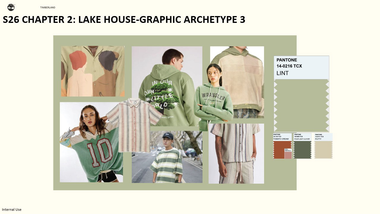
Showing how graphics colors can show up for this drop on Lint as ground.
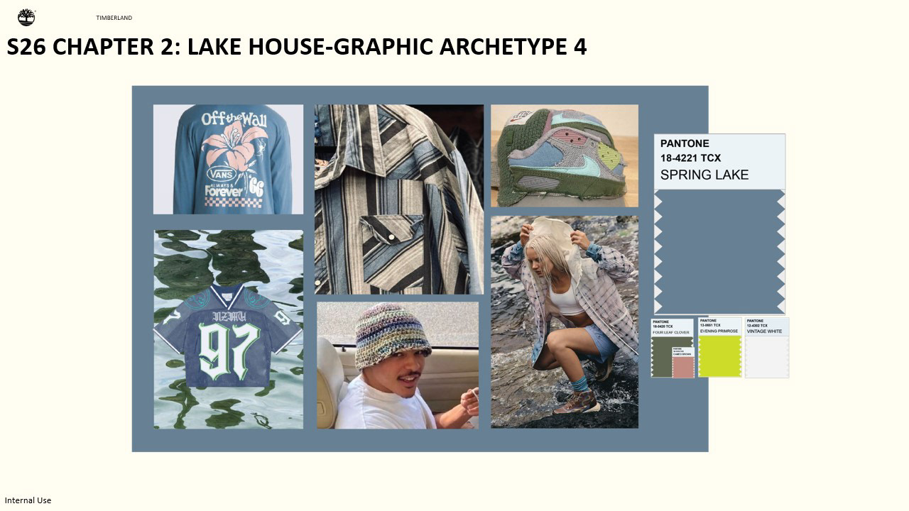
And on Spring lake, I wanted to show it in a color that is introduced in Spring and carried through Summer.
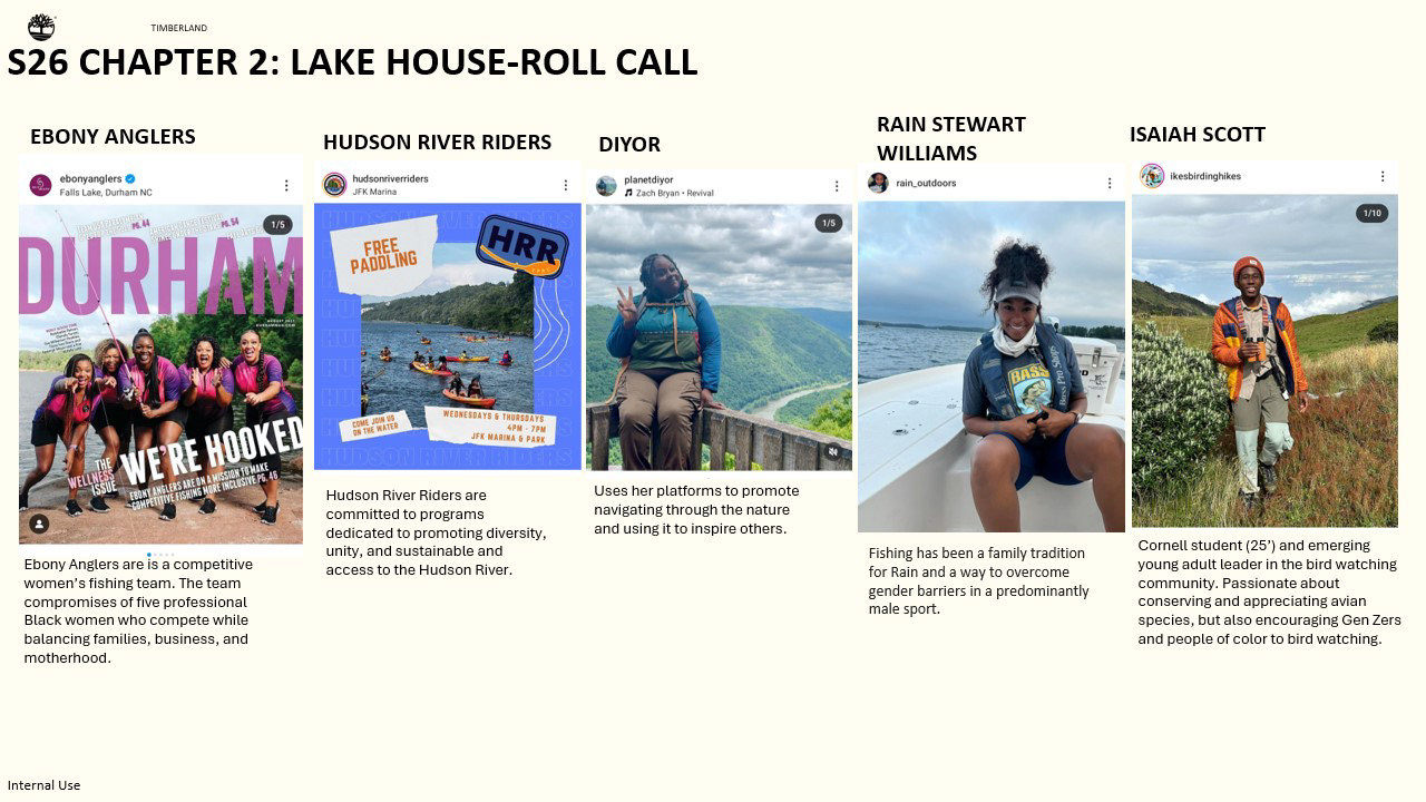
I also wanted to introduce some groups and creators who inspired this concept that are making spaces inclusive in the outdoors both in cities and the greater outdoors. I came across the Ebony Anglers and rain outdoors and they actually inspired this concept. I believe that these conversations can be had in apparel that could lead to permanent changes in these spaces and involvement not only in highlighting stories but actively having conversations about it and potential policy changes that affect our consumers and the outdoors as a whole.
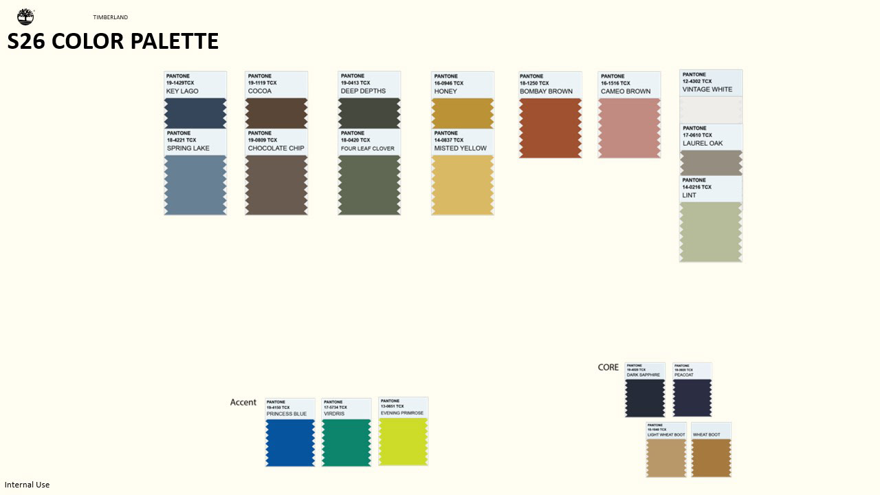
The full Spring and Summer palette the dusty shades of some of these being there to consider washes in t-shirts or knits as a point of reference for when they are developed.
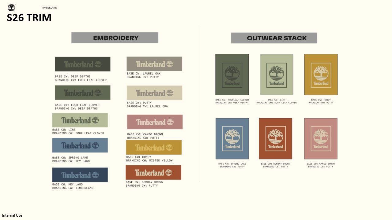
Another step would be to show how the palette would show up as trim to direct the team on which trim would go where to create a uniformity throughout the assortment, and I wanted to show what two style of trims would look like in this palette outside of the core color family.
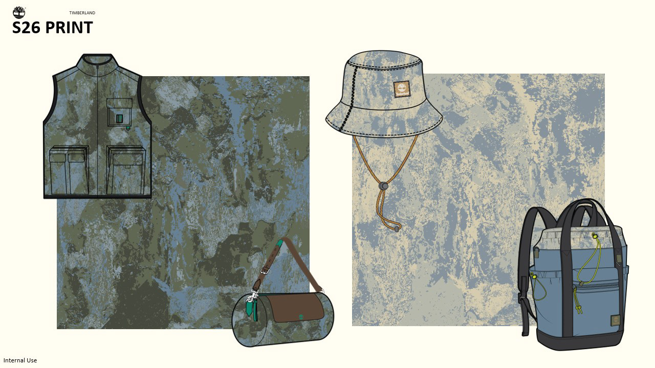
The print of the season, just focusing on 1 due to the tight assortment and living in both seasons just re-colored to fit with the drop but still making sure they could live next to each other on the website or on the floor and next to carryovers. Camo being chosen due to how it could be both an outdoors print and a print that has been adopted into lifestyle.
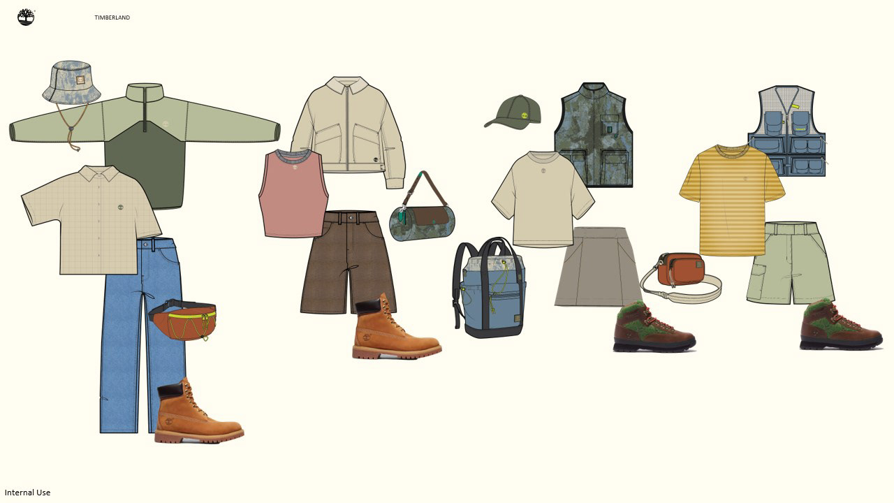
Mix and match the outfits for both drops to show how they could look next to each other on the site or on the floor, and how although one is more focused on lifestyle pieces and the other in outdoors they can be seamlessly mixed with each other creating new outfits, especially as we consider consumers not saving their outdoor items just for the outdoors. Making sure the consumer is always ready for the next adventure.


